Feeds:
Posts
Comments

Archive for the ‘Usability No-no’ Category

Footer menus are wonderful things. They make life bearable.

When I finally get to the bottom of a long (or any length for that matter) web page, having scanned all there is to see, it’s nice to have a footer menu saving me from having to scroll all the way back to the top of the screen:

Web site with a footer menu

Unless, of course, this is what happens for each and every menu item I click:

That’s right – no matter what menu item I select, I simply end up back at the top of the current screen.

My Recommendation:

Ummmm…this one is kind of easy….

If it looks like a menu, it should act like a menu.

Read Full Post »

Just a quickie for today…

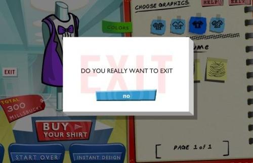
No 'yes' option on 'Are you sure you want to Exit' screen

Maybe this is why online games for kids are so addicting – there’s no way to get out!

Read Full Post »

Why is it so easy to find web forms that just don’t work well? Particularly when it comes to what should be simple workflows users are used completing over and over again. There really is no excuse. Here is another example of a simple form gone wrong…

I am submitting a request so the first thing I am being asked for is my contact information:

Contact Form

Scanning the form quickly I see date is already filled in and I am asked to leave it in the field. The rest of the fields are expected information to be asked, and I know this stuff like the back of my hand, so fine with me. Following the instructions, I skip over the date field; enter the rest of the required fields, then hit Submit:

Form with Error Popup

Okie dokie… Why the heck am I getting an error on the one field I was explicitly asked not to edit? Of course, I can no longer see that field since the pop is hiding it, so I am unable to immediately figure why. I decide to move the pop-up window out of the way so I can see what went wrong here:

Error in pre-filled field

Nice! The one field I was not responsible for entering already has an error! The year says 110! So, even though I completed all my data entry correctly, I hit a roadblock. If they wanted me to leave the field untouched, the least they could have done was make sure the pre-entered data was correct!

My Recommendation:

Since they obviously do not want the date changed from today’s date, there is no reason to have the date be a data entry field at all. When a user accesses this screen, the date of request could simply appear (correctly) as uneditable data on the screen. Or better yet, why show it all? Do I need to be reminded that the date of my request is today? I think I know that. If the underlying workflow needs this information it can be added outside of the user’s interaction.

A simple step that could have been removed is instead going to lead to an error for each and every user who doesn’t realize they need to correct the field they were asked to leave alone.

Read Full Post »

I happened to be checking out a listing of healthcare application vendors and found the use of tooltips to be kind of backwards – Here’s what I mean:

Table with tooltips for each cell

Each and every cell in the table shows me a tooltip that is an exact copy of the data in the cell itself.

I then started checking out the rest of the table and I discovered a place where tooltips probably would have been helpful:

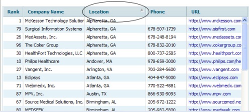
Table with sort function within column header but no tooltip

Table with sorted column after clicking header

I am given absolutely no indication that an action can be done by clicking the column headers. Turns out the columns are sortable if I click on the headers.

I looked at the page a little closer and at the top of the screen I found this:

“You can view the interactive list presented at the top in which you can click the column headings to sort by column”

They did try to let users know that the sorting capability is included in the table structure (although the wording also has me bewildered). Unfortunately for them, it has been shown that folks often do not take the time to read the extraneous content when the key information is directly in front of them…

My Recommendation:

Tooltips should provide additional, useful context around the item being hovered over (i.e. displaying print when hovering over a printer icon or spelling out a term when an acronym is used within content) rather than just repeating the same information already being displayed to the user.

It would be more appropriate to refrain from using the tooltips for each individual cell in the table and rather put it to use when a user hovers over the column headers to let them know there is functionality built within them (i.e. Sort by Location).

Read Full Post »

Older Posts »