Feeds:
Posts
Comments

One of the questions I ask myself over and over again when I am surfing the web and I come across a UI design or interaction that seems out of whack is “Did they bother to test this with any users?” – My gut tells me no. And quite often in my day job, when I approach teams about the possibility of doing some usability testing on a proposed design, I get pushback like ‘we can’t add more time to our already tight schedule’ or ‘we don’t have resources to build a prototype to do that.” Considering the value that can come from usability testing, I am amazed at how bad a wrap it has gotten, so I’d like to share a couple of quick, easy and cheap ways I have done usability testing with great results – who knows, maybe some sites I’ve highlighted on this blog will take note and try a few of them out! 🙂

Quick and cheap method #1 – Survey

When working on a UI redesign some time ago, we had a couple different directions we could go in and what we thought were good reasons for picking either one over the other. Rather than relying on an arm wrestling match to decide the winner (and always wondering if the other might really have been better), I decided to take some quick screen shots illustrating the various components of each design and created a survey.

I used Survey Monkey (http://www.surveymonkey.com/) which offers a free version as well as more robust paid offerings. I simply uploaded the screen shots and created simple A/B comparison questions. This took me a couple of hours to complete. Once it was done I sent the survey link out, via email, to both some internal folks and some of our target users. Authoring the email and sending it off once again took me a couple of hours. I left the survey active for about 3 days and got participation from approximately 22 people.

During the hour it took for me to analyze the results, it was obvious they were overwhelmingly for one design over the other. Within 4 days, precious little of my own time and almost no money, I was given the unwavering confidence to move forward with a design that I knew would more likely meet my users’ needs.

Quick and cheap method #2 – Office Proxy

I love this method because it offers immediate gratification! Yes, my company is a software development organization with a lot of technologically superior folks 🙂 but that doesn’t mean that everyone who works there is a techie or even necessarily web savvy. I have a few folks whom I greatly admire because they pretty accurately reflect our user demographic and mental models. These are folks I can go to with what I think seems like a pretty simple interaction, but as soon as I see the look on their face, I know I might have gotten something wrong. Or even better, I jump for joy when I confirm that I got it right!

I’ve shown these folks hand drawn task flows and paper prototypes as well as having invited them over to my desk for a preview of a high fidelity simulation or a walkthrough in a test environment (it’s never too early or too late to usability test). And for a few minutes (and maybe the price of a coffee from Starbucks) I can gain some insight in whether things are on the right track or we might want to consider other possibilities. The same idea could be put in place with friends and family.

Quick and cheap method #3 – Web Conferencing

Online meetings have made a big difference in the corporate world – no more plane trips to cram everyone in a conference room for an hour meeting before they have to head off to the airport again. The same could also hold true for Usability Testing – take away the time and expense of travelling to your users, but still be able to talk with and have them complete a workflow within their natural environment via web conferencing.

There are a bunch of free online conferencing products out there and several others that offer free 30 trial periods. You want to look for one that will allow you to give control of your computer to someone else attending the meeting.

With the web conferencing set up, it’s quite simple – Send out an invite to a user to attend your web conference. I usually do this by email, introducing them to what we are hoping to test and giving them a choice of times to participate (I’ll send out a bunch of emails scheduling times over a 2 or 3 day period). Once the time comes for a session with a user I typically remind them of the concepts I am hoping to test, then I quickly and easily give them access to my computer so that they can work their way through the scenarios I am interested in. I have done this type of testing with both prototypes and applications that are in the testing phase within a test environment. Once the testing is complete, I simply take control back and thank them for their time. You can even set up a video camera aimed on your computer to record the entire session allowing for additional review later on (or even better to share with your stakeholders).

This method does require more time to schedule, create your testing scenarios and actually perform the test, but it benefits are worthwhile, as you are able to directly converse with your users working through the application in their own environments without having to leave your office. And you can gather some great data to share with your team in a typically shorter time frame than it would have taken to travel to your users for the same information.

I hope you find something worth considering in the above options for usability testing on the cheap. There is a goldmine of insight you can gather from your users and it is there for the taking…And believe it or not, it doesn’t take a fortune – or a month – to enable them to share it with you! Now go out there and do some testing!

I know I typically share user experiences that I feel are lacking in the whole ‘understanding your users’ department, but today I actually have an interaction that I think goes above and beyond from the UX perspective. A collective round of applause please!

I was checking out a site that offers wire framing and prototyping products:

Site with a Feedback Link

This is a nice intuitive, streamlined UI. But the thing that really caught my eye was the little ‘Give Feedback’ image in the upper right hand column.

Feedback widget

Curiosity killed that cat, so I had to click on it, and I was presented with one of the most well designed Contact forms I have ever encountered:
Feedback form with category selection

What makes this so special you say? Well the first thing I noticed is that they seem genuinely interested in my feedback as opposed to who I am and what my contact information is. Instead of immediately asking me for that type of information, their first question is ‘what kind of feedback might that be’ – and rather than presenting it via a sterile dropdown as so often is the case, they instead make it a little more fun by putting the most common types of feedback right out in the open as buttons where I can simply click the one I want. None of the specific categories match? That’s okay too; there is an Other Feedback option. I also want to point out that the entire interaction is keyboard accessible.

I pick the type of feedback I’d like to give and:
Feedback form text entry

A text box appears, highlighted and focus is already in the text box for me. All I need to do is to start typing my comments. And all of the other feedback categories are still front and center in case I decide that a different subject would be more appropriate. I type in my comments and hit Send…
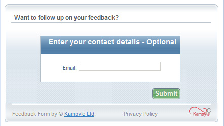
Feedback form with contact info optional

The only piece of personal information being asked for from me is my email address, and I only need to give it if I want to ensure someone follows up with me. How awesome is that?!

It’s funny, but when I blog about my negative user experiences I feel it necessary to protect the offenders and blur out identifying information. But when I encounter an experience as positive as this, I want to yell the site/company names from the mountaintop! This interaction shows that Kampyle has made good use of their time and energy to ensure that the product they were creating was going to meet the needs of both the sites that purchase it and the users who would actually be sending the feedback. Kudos to Kampyle!

Where for art thy Error?

I was reading an article about ways to increase traffic to your blog, because who doesn’t want more folks coming their site and realizing the wisdom in their words. 🙂

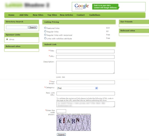
Anyway, the article mentioned submitting your site to a multitude of free blog directories, so I figured I’d give it try. Site after site asked for the same basic information. Here I am on about the fourth site:
Blank Registration Form

Piece of cake, I’d already filled out this same basic stuff 3 times before. The one thing I didn’t want to do was put reciprocal links on my blog, which according to the terms was fine, so I just left that field blank each time. I finished filling out this form, hit submit, and got this:
Registration Form with unseen error

Hmmmm….did it submit? My guess is no…but if not why didn’t it? I start inspecting the screen, field by field, until notice this:
Unobvious Error Message

Suddenly the reciprocal link field has become required (yes, scroll up to the first screenshot if you don’t believe me!) – or maybe they are using the exact same image for their error notation?! I have no clue. And even more interesting the error message (in the exact same font color and size as everything else on the screen) states that I entered an Invalid URL – can the lack of a URL actually make it invalid?

I was basically stuck at this point, I wasn’t going to go down the whole reciprocal link path, so I abandoned the task. I guess this is one blog directory you won’t find LiveUX in…

My Recommendation:

If a user makes an error in a workflow you want to direct them right to the source of the error so they can fix it quickly and easily.

  • The error message itself can appear either at the top of screen (indicating the specific field that is in error) or placing it in close proximity to the field itself (usually to the right or below the field).
  • Use an indicator to highlight the invalid field (for example a red X to the right of the field). Do not use an image that has more than one meaning.
  • The error message should by styled to stand out from the rest of the text on the screen. The norm is to use red text.
  • The error message should accurately describe the error that was made. It is also best to include the step(s) a user can take to correct it.

Okay, that’s about it for me today…I’m going to register LiveUX with a few more directories…wish me luck!

Search This

I love perusing decorating sites. It’s always fun to collect inspiration photos to add to my collection. So off to a well known decorating site I go. Today I was looking for ideas for a kid’s room, preferably something nautical. I typed my search criteria (Nautical Bedroom) into their handy Search field:

Search input field

And here are my results:
No Search Results found

Huh? I’m on a decorating site! Why did I just get a ‘No recipes found’ message?! Once I look back at my original search I realized that the default search option is for the Recipe section only. This seems so odd to me on a decorating site.

My recommendation:
Make sure your default settings match what your user would expect them to be. I am hard pressed to believe that the vast majority of searches on this site are for recipes as opposed to decorating or some other topic. Or, for a site like this that has many topics, search the whole site, then allow the user to filter based on the topics that might be of interest to them.

Funny thing…As I was preparing this post I went back to the site to check something out and lo and behold, they have updated their Search. The whole Recipes/Site paradigm is gone and the default is now to search the entire site. Maybe they got an advanced copy of my post! 🙂